文本组件(text)负责显示文本和定义显示样式,下表为text常见属性
Text组件属性及描述
| 属性名 |
类型 |
默认值 |
说明 |
| data |
String |
|
要显示的文本 |
| maxLines |
int |
0 |
文本要显示的最大行数 |
| style |
TextStyle |
null |
文本样式,可定义文本的字体大小、颜色、粗细等 |
| textAlign |
TextAlign |
TextAlign.center |
文本水平方向的对齐方式,取值有center、end、justify、left、right、start、values |
| textDirection |
TextDirection |
TextDirection.ltr |
文本的书写方向,如从左到右、从右到左 |
| textScaleFactor |
double |
1.0 |
字体的缩放系数,比如,如果此属性设置的值为1.5,那么字体会被放大到150%,也就是说比原来大了50% |
| textSpan |
TextSpan |
null |
文本块,TextSpan里可以包含文本内容及样式 |
老样子,按照惯例附上Demo,创建多个文本组件来展示不同的文本样式,比如不同的颜色,不同的自号,不同的线形等。
- import 'package:flutter/material.dart';
- void main() => runApp(DemoApp());
- class DemoApp extends StatelessWidget{
- @override
- Widget build(BuildContext context) {
- return new MaterialApp(
- title: '文本组件Demo',
- home: new Scaffold(
- appBar: new AppBar(
- title: Text('文本组件Demo'),
- ),
- body: new Column(
- children: <Widget>[
- new Text(
- '第一个文本Demo',
- style: new TextStyle(
- color: Colors.amberAccent,
- fontSize: 20,
- ),
- ),
- new Text(
- '第二个文本Demo',
- style: new TextStyle(
- color: Colors.deepOrange,
- fontSize: 20,
- ),
- textScaleFactor: 1.5,//放大50%
- ),
- new Text(
- '第三个文本Demo(瞎写的瞎写的瞎写的瞎写的瞎写的瞎写的瞎写的瞎写的瞎写的瞎写的瞎写的瞎写的瞎写的瞎写的瞎写的瞎写的瞎写的)',
- style: new TextStyle(
- color: Colors.blue,
- fontSize: 20,
- ),
- textAlign: TextAlign.end,//右对齐
- ),
- new Text(
- '''第四个文本Demo
- 换到第二行,看看能不能显示的出来呢''',
- style: new TextStyle(
- fontSize: 20,
- color: Colors.green,
- ),
- maxLines: 2,//最大显示2行
- ),
- new Text(
- '第五个Demo,设置水平方向文案超出屏幕后,显示...(瞎写的字瞎写的字瞎写的字瞎写的字瞎写的字瞎写的字瞎写的字瞎写的字)',
- style: new TextStyle(
- fontSize: 20,
- color: Colors.black,
- ),
- overflow: TextOverflow.ellipsis,//水平方向超出屏幕显示...
- )
- ],
- ),//垂直方向排列
- ),
- );
- }
- }
除了这些,还有很多其他的属性等着我们去尝试,我就不一一都写出来了,我也是刚开始接触Flutter,有些地方还不是很理解,希望以后接触的多了,可以豁然开朗吧!!!给大家看一下效果图:

图标组件(Icon)为展示图标的组件,该组件不可交互,要实现可交互,可以考虑使用IconButton组件,图标组件相关的组件有一下几个:
1.IconButton:可交互的Icon
2.Icons:框架自带Icon集合
3.IconTheme:Icon主题
4.ImageIcon:通过AssetImages或者其他图片显示Icon
图标组件常用属性表
| 属性名 |
类型 |
默认值 |
说明 |
| color |
Color |
null |
图标的颜色 |
| icon |
IconData |
null |
展示的具体图标,可以使用Icons图标列表中的任意一个图标即可,如Icons.phone表示一个电话的图标 |
| style |
TextStyle |
null |
文本样式 |
| size |
Double |
24.0 |
图标的大小,注意要带上小数位 |
| textDirection |
TextDirection |
TextDirection.ltr |
文本排列方向 |
附上Demo代码:
- import 'package:flutter/material.dart';
- void main() => runApp(DemoApp());
- class DemoApp extends StatelessWidget{
- @override
- Widget build(BuildContext context) {
- return new MaterialApp(
- title: '图标组件Demo',
- home: new IconDemo(),
- );
- }
- }
- class IconDemo extends StatelessWidget {
- @override
- Widget build(BuildContext context) {
- return new Scaffold(
- appBar: new AppBar(
- title: new Text('图标组件Demo'),
- ),
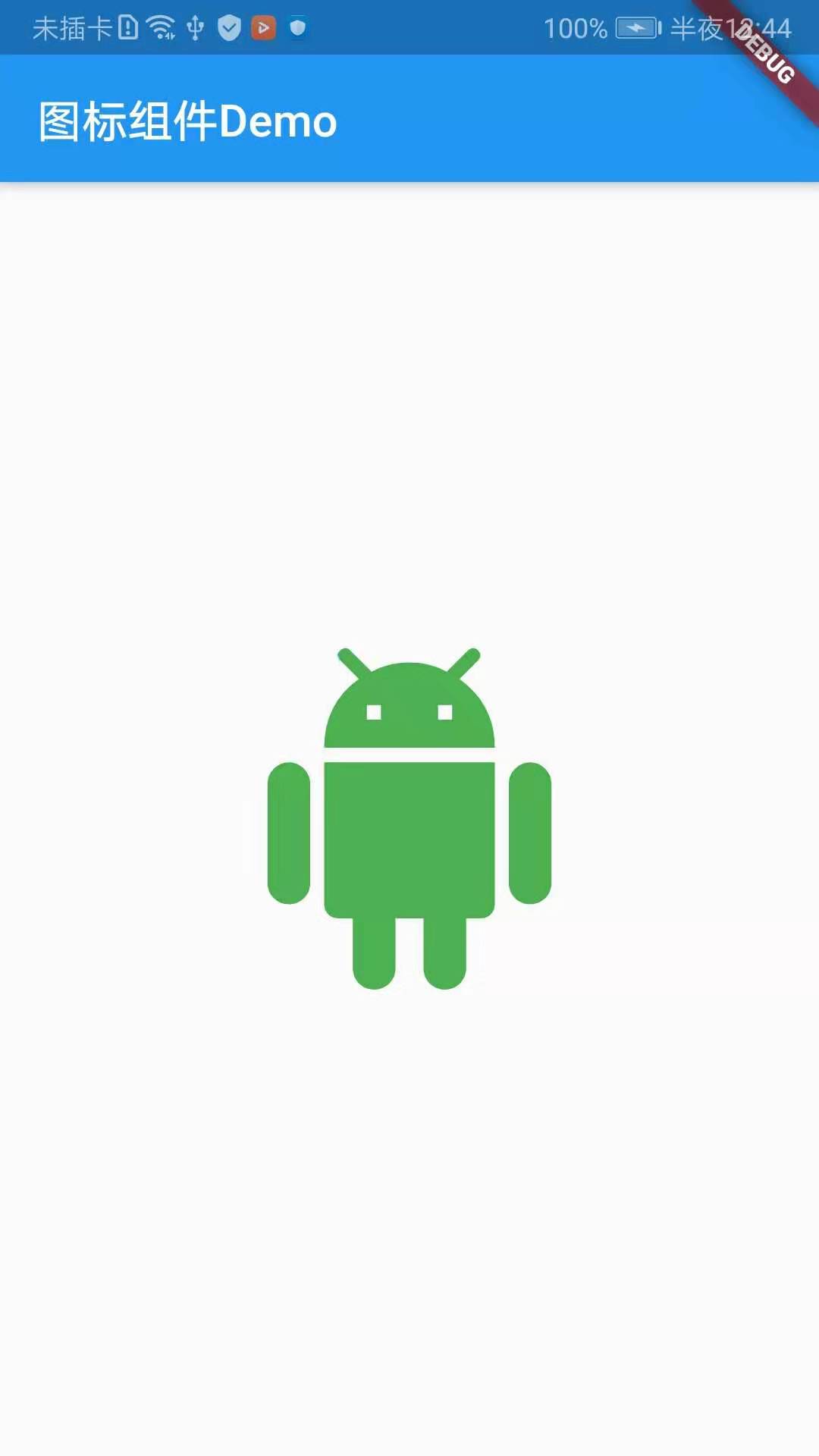
- body: new Center(
- child: new Icon(
- Icons.android,//图标Icon
- color: Colors.green,//图标颜色,设置为绿色,原本的颜色是黑色的
- size: 150.0,//Icon的大小
- ),
- ),
- );
- }
- }
附上效果截图:
图标按钮组件(IconButton)是基于Material Design风格的组件,他可以响应按下事件,并且按下时会带一个水波纹的效果,如果它的onPressed回调函数为null,那么这个按钮处于禁用的状态,并且不可以按下。
IconButton组件属性及描述
| 属性名 |
类型 |
默认值 |
说明 |
| alignment |
AlignmentGeometry |
Alignment.center |
定义IconButton的Icon对齐方式,默认为居中,Alignment是可以设置x,y偏移量的 |
| icon |
Widget |
null |
展示的具体图标,可以使用Icons图标列表中的任意一个图标 |
| color |
Color |
null |
图标颜色 |
| disabledColor |
Color |
ThemeData.disableColor |
图标组件禁用的颜色 |
| iconSize |
double |
24.0 |
图标大小 |
| onPressed |
VoidCallBack |
null |
当按钮按下时会触发此回调事件 |
| tooltip |
String |
“” |
当按钮按下时的组件提示语 |
写一个Demo,实现点击IconButton,出发onPressed回调并toast一句话,附上Demo代码:
- import 'package:flutter/material.dart';
import 'package:fluttertoast/fluttertoast.dart';
void main() => runApp(DemoApp());
class DemoApp extends StatelessWidget{
@override
Widget build(BuildContext context) {
return new MaterialApp(
debugShowCheckedModeBanner: false,
title: 'IconButtonDemo',
home: new IconButtonDemo(),
);
}
}
class IconButtonDemo extends StatelessWidget {
@override
Widget build(BuildContext context) {
return new Scaffold(
appBar: AppBar(
title: Text('IconButton Demo'),
leading: Icon(Icons.menu),
actions: <Widget>[
IconButton(
icon: Icon(Icons.search),
)
],
),
body: new Center(
child: new IconButton(
icon: Icon(Icons.add_circle_outline),
iconSize: 50.0,
tooltip: '用户按下了按钮',
disabledColor: Colors.green,
onPressed: (){
Fluttertoast.showToast(
msg: '点击了IconButton并且Toas了一句话',
toastLength: Toast.LENGTH_LONG,
textColor: Colors.deepOrange,
gravity: ToastGravity.BOTTOM
);
}),
),
);
}
}
附上效果截图:

上面的代码除了演示了IconButton的简单使用,还对AppBar做了一些出了,在title的左右增加了两个图片,当然你也可以对其设置点击事件
注:这里和大家说一下在Flutter中怎么Toast出提示语,首先在pubspec.yaml引入fluttertoast包,点击Packages get,然后在你需要toast的地方import该库
- //pubspec.yaml
- fluttertoast: ^2.2.11
-
- //import对应库
- import 'package:fluttertoast/fluttertoast.dart';
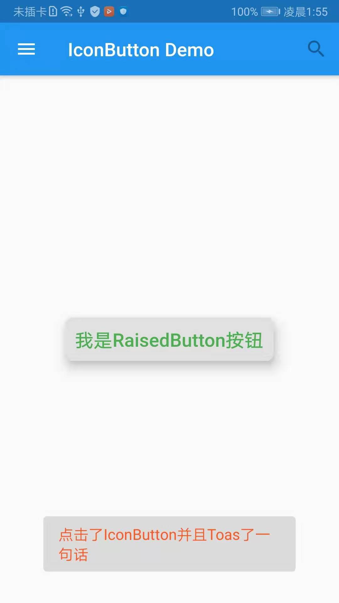
突起按钮组件(RaisedButton),往往我们在开发过程中,不会一直用系统的图标,那么如果一个按钮上需要我们添加自定义的文本,这样的按钮要怎么实现呢?
- import 'package:flutter/material.dart';
- import 'package:fluttertoast/fluttertoast.dart';
- void main() => runApp(DemoApp());
- class DemoApp extends StatelessWidget{
- @override
- Widget build(BuildContext context) {
- return new MaterialApp(
- debugShowCheckedModeBanner: false,
- title: 'IconButtonDemo',
- home: new IconButtonDemo(),
- );
- }
- }
- class IconButtonDemo extends StatelessWidget {
- @override
- Widget build(BuildContext context) {
- return new Scaffold(
- appBar: AppBar(
- title: Text('IconButton Demo'),
- leading: Icon(Icons.menu),
- actions: <Widget>[
- IconButton(
- icon: Icon(Icons.search),
- )
- ],
- ),
- body: new Center(
- child: new RaisedButton(
- padding: const EdgeInsets.all(10.0),//内间距
- splashColor: Colors.blue,//点击时按钮的颜色
- elevation: 10,
- shape: BeveledRectangleBorder(//带斜角的长方形边框
- borderRadius: BorderRadius.all(Radius.circular(5))//圆角
- ),
- onPressed: (){
- Fluttertoast.showToast(
- msg: '点击了IconButton并且Toas了一句话',
- toastLength: Toast.LENGTH_LONG,
- textColor: Colors.deepOrange,
- gravity: ToastGravity.BOTTOM
- );
- },
- //按钮内的文本
- child: new Text(
- '我是RaisedButton按钮',
- style: TextStyle(
- color: Colors.green,
- fontSize: 20.0,
- ),
- ),
- ),
- ),
- );
- }
- }
附上效果截图:
代码内有很详细的注释,如果有疑问的话,欢迎留言!!!
今天到这里就结束了,希望每一天的博客都可以给一些像我一样刚开始接触Flutter人一些小小的帮助!!!
下一章节:Flutter学习笔记(12)--列表组件

 经验首页
经验首页