Android—MaterialCardView的使用

我们的征程是星辰大海,而非人间烟尘
文章目录 Android---MaterialCardView的使用演示xml布局其他的属性
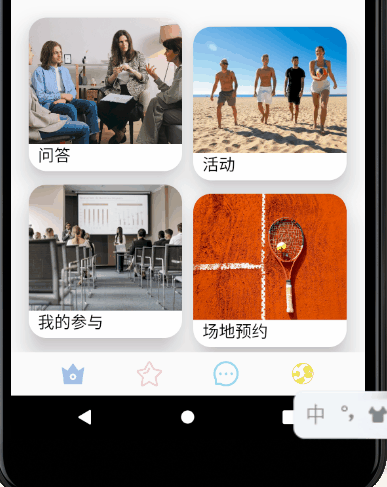
演示
xml布局
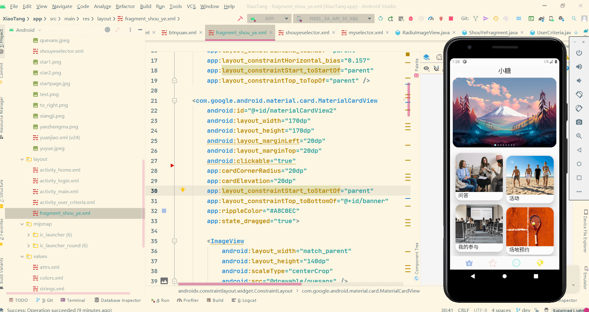
- <com.google.android.material.card.MaterialCardView
- android:id="@+id/materialCardView2"
- android:layout_width="170dp"
- android:layout_height="170dp"
- android:layout_marginLeft="20dp"
- android:layout_marginTop="20dp"
- android:clickable="true" // 是否可点击
- app:cardCornerRadius="20dp" // 圆角半径
- app:cardElevation="20dp" // 阴影范围
- app:layout_constraintStart_toStartOf="parent"
- app:layout_constraintTop_toBottomOf="@+id/banner"
- app:rippleColor="#A8C0EC" // 点击阴影特效的颜色
- app:state_dragged="true">
-
- <ImageView
- android:layout_width="match_parent"
- android:layout_height="140dp"
- android:scaleType="centerCrop"
- android:src="@drawable/quesans" />
-
- <TextView
- android:layout_width="match_parent"
- android:layout_height="30dp"
- android:layout_marginLeft="10dp"
- android:layout_marginTop="140dp"
- android:text="问答"
- android:textColor="@color/black"
- android:textFontWeight="@android:integer/config_mediumAnimTime"
- android:textSize="18sp" />
- </com.google.android.material.card.MaterialCardView>
其他的属性
| 特征 |
相关属性 |
| Border |
app:strokeColor app:strokeWidth |
| Checkable |
android:checkable |
| Checked Icon |
app:checkedIcon app:checkedIconTint |
| Foreground Color |
app:cardForegroundColor |
| Ripple Color |
app:rippleColor |
当然你还可以在Java/Kotlin代码中使用一些方法:
- void setCheckable (boolean checkable)//设置是否可以选择
- void setChecked (boolean checked)//选中的状态
- void setCheckedIcon (Drawable checkedIcon)//选中图标的样式
- void setCheckedIconResource (int id)//选中图标的样式
- void setDragged (boolean dragged)//是否可拖动
- void setRippleColor (ColorStateList rippleColor)//波纹效果的颜色
- void setStrokeColor (int strokeColor)//卡片边的颜色
- void setStrokeWidth (int strokeWidth)//卡片边的宽带
- void toggle ()//控制checkable的开关
到此这篇关于Android MaterialCardView的使用介绍与示例 的文章就介绍到这了,更多相关Android MaterialCardView内容请搜索w3xue以前的文章或继续浏览下面的相关文章希望大家以后多多支持w3xue!

 经验首页
经验首页