七夕情人节送花动画告白特效
效果展示

代码展示:
- <div id='content'>
- <ul class='content-wrap'>
- <!-- 第一副画面 -->
- <li>
- <!-- 背景图 -->
- <div class="a_background">
- <div class="a_background_top"></div>
- <div class="a_background_middle"></div>
- <div class="a_background_botton"></div>
- </div>
- <!-- 云 -->
- <div class="cloudArea">
- <div class="cloud cloud1"></div>
- <div class="cloud cloud2"></div>
- </div>
- <!-- 太阳 -->
- <div id="sun"></div>
- </li>
- <!-- 第二副画面 -->
- <li>
- <!-- 背景图 -->
- <div class="b_background"></div>
- <div class="b_background_preload"></div>
- <!-- 商店 -->
- <div class="shop">
- <div class="door">
- <div class="door-left"></div>
- <div class="door-right"></div>
- </div>
- <!-- 灯 -->
- <div class="lamp"></div>
- </div>
- <!-- 鸟 -->
- <div class="bird"></div>
- </li>
- <!-- 第三副画面 -->
- <li>
- <!-- 背景图 -->
- <div class="c_background">
- <div class="c_background_top"></div>
- <div class="c_background_middle"></div>
- <div class="c_background_botton"></div>
- </div>
- <!-- 小女孩 -->
- <div class="girl"></div>
- <div class="bridge-bottom">
- <div class="water">
- <div id="water1" class="water_1"></div>
- <div id="water2" class="water_2"></div>
- <div id="water3" class="water_3"></div>
- <div id="water4" class="water_4"></div>
- </div>
- </div>
- <!-- 星星 -->
- <ul class="stars">
- <li class="stars1"></li>
- <li class="stars2"></li>
- <li class="stars3"></li>
- <li class="stars4"></li>
- <li class="stars5"></li>
- <li class="stars6"></li>
- </ul>
- <div class="logo">祝天下有情人终成眷属</div>
- </li>
- </ul>
- <!-- 雪花 -->
- <div id="snowflake"></div>
- <!-- 小男孩 -->
- <div id="boy" class="charector"></div>
- </div>
玫瑰花盛开动画告白特效
效果展示:

代码展示:
- <radialGradient id="gradient-0" gradientUnits="userSpaceOnUse" cx="-107.308" cy="104.329" r="59.181" gradientTransform="matrix(0.261752, 0.411262, -0.686293, 0.596934, 160.094667, 49.38985)">
- <stop offset="0" style="stop-color: rgb(255, 0, 0);"/>
- <stop offset="1" style="stop-color: rgb(141, 41, 41);"/>
- </radialGradient>
- var svg = document.getElementById('svg');
-
- var animation0 = document.getElementById('animate0');?
- svg.addEventListener('mouseenter', function(){ animation0.beginElement(); });
- var animation1 = document.getElementById('animate1');?
- svg.addEventListener('mouseenter', function(){ animation1.beginElement(); });
- var animation2 = document.getElementById('animate2');?
- svg.addEventListener('mouseenter', function(){ animation2.beginElement(); });
- var animation3 = document.getElementById('animate3');?
- svg.addEventListener('mouseenter', function(){ animation3.beginElement(); });
- var animation4 = document.getElementById('animate4');?
- svg.addEventListener('mouseenter', function(){ animation4.beginElement(); });
- var animation5 = document.getElementById('animate5');?
- svg.addEventListener('mouseenter', function(){ animation5.beginElement(); });
- var animation6 = document.getElementById('animate6');?
- svg.addEventListener('mouseenter', function(){ animation6.beginElement(); });
- var animation7 = document.getElementById('animate7');?
- svg.addEventListener('mouseenter', function(){ animation7.beginElement(); });
- var animation8 = document.getElementById('animate8');?
- svg.addEventListener('mouseenter', function(){ animation8.beginElement(); });
- var animation9 = document.getElementById('animate9');?
- svg.addEventListener('mouseenter', function(){ animation9.beginElement(); });
- var animation10 = document.getElementById('animate10');?
- svg.addEventListener('mouseenter', function(){ animation10.beginElement(); });
- var animation11 = document.getElementById('animate11');?
- svg.addEventListener('mouseenter', function(){ animation11.beginElement(); });
- var animation12 = document.getElementById('animate12');?
- svg.addEventListener('mouseenter', function(){ animation12.beginElement(); });
- var animation13 = document.getElementById('animate13');?
- svg.addEventListener('mouseenter', function(){ animation13.beginElement(); });
- var animation14 = document.getElementById('animate14');?
- svg.addEventListener('mouseenter', function(){ animation14.beginElement(); });
3d旋转相册
效果展示:

代码展示:
- <div class="hovertreeinfo">
- ?? ??? ??? ?<h2></h2>
- ?? ??? ?</div>
- ?? ??? ?<!-- 仅自动播放音乐 -->
- ?? ??? ?<!--<audio loop src="img/qianyuqianxun.mp3" id="audio" autoplay preload="auto">该浏览器不支持audio属性</audio>-->
- ?? ??? ?<audio loop src="img\qianyuqianxun.mp3" id="audio" controls autoplay preload="auto">该浏览器不支持audio属性</audio>
- ?? ??? ?<script type="text/javascript">
- ?? ??? ?//--创建页面监听,等待微信端页面加载完毕 触发音频播放
- ?? ??? ?document.addEventListener('DOMContentLoaded', function () {
- ?? ??? ??? ?function audioAutoPlay() {
- ?? ??? ??? ??? ?var audio = document.getElementById('audio');
- ?? ??? ??? ??? ??? ?audio.play();
- ?? ??? ??? ??? ?document.addEventListener("WeixinJSBridgeReady", function () {
- ?? ??? ??? ??? ??? ?audio.play();
- ?? ??? ??? ??? ?}, false);
- ?? ??? ??? ?}
- ?? ??? ??? ?audioAutoPlay();
- ?? ??? ?});
- ?? ??? ?//--创建触摸监听,当浏览器打开页面时,触摸屏幕触发事件,进行音频播放
- ?? ??? ?document.addEventListener('touchstart', function () {
- ?? ??? ??? ?function audioAutoPlay() {
- ?? ??? ??? ??? ?var audio = document.getElementById('audio');
- ?? ??? ??? ??? ??? ?audio.play();
- ?? ??? ??? ?}
- ?? ??? ??? ?audioAutoPlay();
- ?? ??? ?});
- ?? ??? ?</script>
-
- ?? ??? ?<!--/*外层最大容器*/-->
- ?? ??? ?<div class="wrap">
- ?? ??? ??? ?<!--?? ?/*包裹所有元素的容器*/-->
- ?? ??? ??? ?<div class="cube">
- ?? ??? ??? ??? ?<!--前面图片 -->
- ?? ??? ??? ??? ?<div class="out_front">
- ?? ??? ??? ??? ??? ?<img src="img/img01.jpg " class="pic" />
- ?? ??? ??? ??? ?</div>
- ?? ??? ??? ??? ?<!--后面图片 -->
- ?? ??? ??? ??? ?<div class="out_back">
- ?? ??? ??? ??? ??? ?<img src="img/img02.jpg" class="pic"/>
- ?? ??? ??? ??? ?</div>
- ?? ??? ??? ??? ?<!--左图片 -->
- ?? ??? ??? ??? ?<div class="out_left">
- ?? ??? ??? ??? ??? ?<img src="img/img03.jpg" class="pic" />
- ?? ??? ??? ??? ?</div>
- ?? ??? ??? ??? ?<div class="out_right">
- ?? ??? ??? ??? ??? ?<img src="img/img04.jpg" class="pic" />
- ?? ??? ??? ??? ?</div>
- ?? ??? ??? ??? ?<div class="out_top">
- ?? ??? ??? ??? ??? ?<img src="img/img05.jpg" class="pic" />
- ?? ??? ??? ??? ?</div>
- ?? ??? ??? ??? ?<div class="out_bottom">
- ?? ??? ??? ??? ??? ?<img src="img/img06.jpg" class="pic" />
- ?? ??? ??? ??? ?</div>
- ?? ??? ??? ??? ?<!--小正方体 -->
- ?? ??? ??? ??? ?<span class="in_front">
- ?? ??? ??? ??? ??? ?<img src="img/img07.jpg" class="in_pic" />
- ?? ??? ??? ??? ?</span>
- ?? ??? ??? ??? ?<span class="in_back">
- ?? ??? ??? ??? ??? ?<img src="img/img08.jpg" class="in_pic" />
- ?? ??? ??? ??? ?</span>
- ?? ??? ??? ??? ?<span class="in_left">
- ?? ??? ??? ??? ??? ?<img src="img/img09.jpg" class="in_pic" />
- ?? ??? ??? ??? ?</span>
- ?? ??? ??? ??? ?<span class="in_right">
- ?? ??? ??? ??? ??? ?<img src="img/img10.jpg" class="in_pic" />
- ?? ??? ??? ??? ?</span>
- ?? ??? ??? ??? ?<span class="in_top">
- ?? ??? ??? ??? ??? ?<img src="img/img11.jpg" class="in_pic" />
- ?? ??? ??? ??? ?</span>
- ?? ??? ??? ??? ?<span class="in_bottom">
- ?? ??? ??? ??? ??? ?<img src="img/img12.jpg" class="in_pic" />
- ?? ??? ??? ??? ?</span>
- ?? ??? ??? ?</div>
- ?? ??? ?</div>
点击爱心散开动画告白特效
效果展示:

代码展示:
- <svg height="320" width="320" class="like" onclick="document.body.classList.toggle('liked')">
- ?? ?<path class="path" d="M 160 145 c 15 -90 170 -20 0 90 m 0 -90 c -15 -90 -170 -20 0 90" fill="white"> <!-- 80 by 70 -->
- </svg>
-
- <!-- DECORATIONS (quite a lot of them) -->
- <div class="dot dot-1"></div>
- <div class="dot dot-2"></div>
- <div class="dot dot-3"></div>
- <div class="dot dot-4"></div>
- <div class="dot dot-5"></div>
- <div class="dot dot-6"></div>
- <div class="dot dot-7"></div>
- <div class="dot dot-8"></div>
雷电打出告白文字特效
效果展示:

代码展示:
- <div class="page page-thunder-to-text">
- ?? ?<input id="input" type="text" maxlength="24" placeholder="I love you!">
- ?? ?<canvas id="canvas"></canvas>
- </div>
-
- <script>
- let canvas, ctx, w, h, thunder, text, particles, input;
-
- function Thunder(options) {
- ? ? options = options || {};
- ? ? this.lifespan = options.lifespan || Math.round(Math.random() * 10 + 10);
- ? ? this.maxlife = this.lifespan;
- ? ? this.color = options.color || '#fefefe';
- ? ? this.glow = options.glow || '#2323fe';
- ? ? this.x = options.x || Math.random() * w;
- ? ? this.y = options.y || Math.random() * h;
- ? ? this.width = options.width || 2;
- ? ? this.direct = options.direct || Math.random() * Math.PI * 2;
- ? ? this.max = options.max || Math.round(Math.random() * 10 + 20);
- ? ? this.segments = [...new Array(this.max)].map(() => {
- ? ? ? ? return {
- ? ? ? ? ? ? direct: this.direct + (Math.PI * Math.random() * 0.2 - 0.1),
- ? ? ? ? ? ? length: Math.random() * 20 + 80,
- ? ? ? ? ? ? change: Math.random() * 0.04 - 0.02
- ? ? ? ? };
- ? ? });
-
- ? ? this.update = function(index, array) {
- ? ? ? ? this.segments.forEach(s => { (s.direct += s.change) && Math.random() > 0.96 && (s.change *= -1) });
- ? ? ? ? (this.lifespan > 0 && this.lifespan--) || this.remove(index, array);
- ? ? }
-
- ? ? this.render = function(ctx) {
- ? ? ? ? if (this.lifespan <= 0) return;
- ? ? ? ? ctx.beginPath();
- ? ? ? ? ctx.globalAlpha = this.lifespan / this.maxlife;
- ? ? ? ? ctx.strokeStyle = this.color;
- ? ? ? ? ctx.lineWidth = this.width;
- ? ? ? ? ctx.shadowBlur = 32;
- ? ? ? ? ctx.shadowColor = this.glow;
- ? ? ? ? ctx.moveTo(this.x, this.y);
- ? ? ? ? let prev = { x: this.x, y: this.y };
- ? ? ? ? this.segments.forEach(s => {
- ? ? ? ? ? ? const x = prev.x + Math.cos(s.direct) * s.length;
- ? ? ? ? ? ? const y = prev.y + Math.sin(s.direct) * s.length;
- ? ? ? ? ? ? prev = { x: x, y: y };
- ? ? ? ? ? ? ctx.lineTo(x, y);
- ? ? ? ? });
- ? ? ? ? ctx.stroke();
- ? ? ? ? ctx.closePath();
- ? ? ? ? ctx.shadowBlur = 0;
- ? ? ? ? const strength = Math.random() * 80 + 40;
- ? ? ? ? const light = ctx.createRadialGradient(this.x, this.y, 0, this.x, this.y, strength);
- ? ? ? ? light.addColorStop(0, 'rgba(250, 200, 50, 0.6)');
- ? ? ? ? light.addColorStop(0.1, 'rgba(250, 200, 50, 0.2)');
- ? ? ? ? light.addColorStop(0.4, 'rgba(250, 200, 50, 0.06)');
- ? ? ? ? light.addColorStop(0.65, 'rgba(250, 200, 50, 0.01)');
- ? ? ? ? light.addColorStop(0.8, 'rgba(250, 200, 50, 0)');
- ? ? ? ? ctx.beginPath();
- ? ? ? ? ctx.fillStyle = light;
- ? ? ? ? ctx.arc(this.x, this.y, strength, 0, Math.PI * 2);
- ? ? ? ? ctx.fill();
- ? ? ? ? ctx.closePath();
- ? ? }
-
- ? ? this.remove = function(index, array) {
- ? ? ? ? array.splice(index, 1);
- ? ? }
- }
粒子组合告白文字特效
效果展示:

代码展示:
- ;(function(main) {
- ?? ?var args = {};
- ?? ?window.onload = function() {
- ?? ??? ?main(args);
- ?? ?};
- })(function(args) {
-
- ?? ?'use strict';
-
- ?? ?var Box = function(x, y, w, h, s) {
- ?? ??? ?this.x = x;
- ?? ??? ?this.y = y;
- ?? ??? ?this.w = w;
- ?? ??? ?this.h = h;
- ?? ??? ?this.s = s;
- ?? ??? ?this.a = Math.random() * Math.PI * 2;
- ?? ??? ?this.hue = Math.random() * 360;
- ?? ?};
-
- ?? ?Box.prototype = {
- ?? ??? ?constructor: Box,
- ?? ??? ?update: function() {
- ?? ??? ??? ?this.a += Math.random() * 0.5 - 0.25;
- ?? ??? ??? ?this.x += Math.cos(this.a) * this.s;
- ?? ??? ??? ?this.y += Math.sin(this.a) * this.s;
- ?? ??? ??? ?this.hue += 5;
- ?? ??? ??? ?if(this.x > WIDTH) this.x = 0;
- ?? ??? ??? ?else if(this.x < 0) this.x = WIDTH;
- ?? ??? ??? ?if(this.y > HEIGHT) this.y = 0;
- ?? ??? ??? ?else if(this.y < 0) this.y = HEIGHT;
- ?? ??? ?},
- ?? ??? ?render: function(ctx) {
- ?? ??? ??? ?ctx.save();
- ?? ??? ??? ?ctx.fillStyle = 'hsla(' + this.hue + ', 100%, 50%, 1)';
- ?? ??? ??? ?ctx.translate(this.x, this.y);
- ?? ??? ??? ?ctx.rotate(this.a);
- ?? ??? ??? ?ctx.fillRect(-this.w, -this.h / 2, this.w, this.h);
- ?? ??? ??? ?ctx.restore();
- ?? ??? ?}
- ?? ?};
-
- ?? ?var Circle = function(x, y, tx, ty, r) {
- ?? ??? ?this.x = x;
- ?? ??? ?this.y = y;
- ?? ??? ?this.ox = x;
- ?? ??? ?this.oy = y;
- ?? ??? ?this.tx = tx;
- ?? ??? ?this.ty = ty;
- ?? ??? ?this.lx = x;
- ?? ??? ?this.ly = y;
- ?? ??? ?this.r = r;
- ?? ??? ?this.br = r;
- ?? ??? ?this.a = Math.random() * Math.PI * 2;
- ?? ??? ?this.sx = Math.random() * 0.5;
- ?? ??? ?this.sy = Math.random() * 0.5;
- ?? ??? ?this.o = Math.random() * 1;
- ?? ??? ?this.delay = Math.random() * 200;
- ?? ??? ?this.delayCtr = 0;
- ?? ??? ?this.hue = Math.random() * 360;
- ?? ?};
小熊拉手CSS3情人节动画表白特效
效果展示:
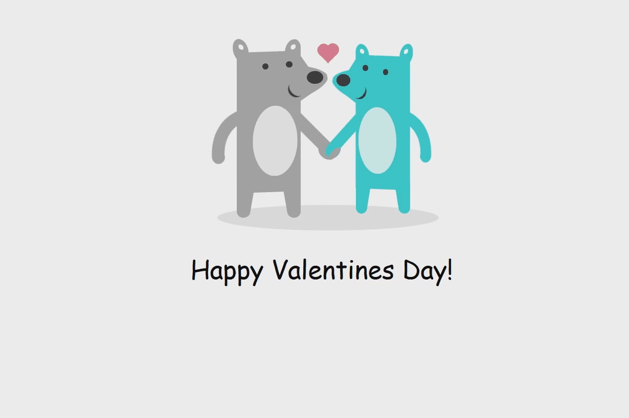
代码展示:
- <div class="stage">
- ? <div class="couple">
- ? ? <div class="heart floating"></div>
- ? ? <div class="bear he">
- ? ? ? <div class="ear--1"></div>
- ? ? ? <div class="ear--2"></div>
- ? ? ? <div class="arm--1"></div>
- ? ? ? <div class="arm--2"></div>
- ? ? ? <div class="hand"></div>
- ? ? ? <div class="body"></div>
- ? ? ? <div class="muzzle"></div>
- ? ? ? <div class="eye--1"></div>
- ? ? ? <div class="eye--2"></div>
- ? ? ? <div class="nose"></div>
- ? ? ? <div class="mouth"></div>
- ? ? ? <div class="leg--1"></div>
- ? ? ? <div class="leg--2"></div>
- ? ? </div>
- ? ? <div class="bear she">
- ? ? ? <div class="ear--1"></div>
- ? ? ? <div class="ear--2"></div>
- ? ? ? <div class="arm--1"></div>
- ? ? ? <div class="arm--2"></div>
- ? ? ? <div class="body"></div>
- ? ? ? <div class="muzzle"></div>
- ? ? ? <div class="eye--1"></div>
- ? ? ? <div class="eye--2"></div>
- ? ? ? <div class="nose"></div>
- ? ? ? <div class="mouth"></div>
- ? ? ? <div class="leg--1"></div>
- ? ? ? <div class="leg--2"></div>
- ? ? </div>
- ? </div>
- </div>
到此这篇关于七个基于JavaScript实现的情人节表白特效的文章就介绍到这了,更多相关JavaScript表白特效内容请搜索w3xue以前的文章或继续浏览下面的相关文章希望大家以后多多支持w3xue!

 经验首页
经验首页