延迟属性与帧延迟效果对比:
- <!DOCTYPE html>
- <html lang="en">
- <head>
- <meta charset="UTF-8">
- <title>Document</title>
- <meta name="viewport" content="width=device-width,minimum-scale=1.0,maximum-scale=1.0,user-scalable=no">
- <link rel="stylesheet" href="https://maxcdn.bootstrapcdn.com/font-awesome/4.7.0/css/font-awesome.min.css">
- <script src="https://cdn.staticfile.org/jquery/1.10.0/jquery.js"></script>
-
- <style>
- *{
- margin:0;
- padding:0;
- box-sizing:border-box;
- }
- body{
- width:100vw;
- height:100vh;
- display:flex;
- justify-content: center;
- align-items: center;
- background-color: #34495e;
- }
-
- div{
- width:100px;
- height:100px;
- background:#ff893b;
- animation-name:scale;
- animation-duration:1s;
- animation-delay:2s;
- animation-iteration-count:infinite;
- }
- @keyframes scale{
- to{
- transform:scale(3);
- }
- }
- </style>
- </head>
- <body>
- <div></div>
-
- </body>
- </html>
微场景页面布局:
也可以使用动画库:swiper animate.css
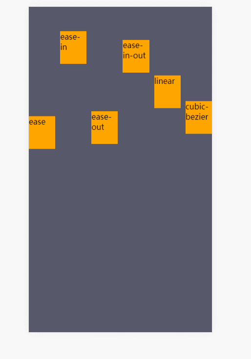
贝塞尔曲线控制动画速率:
- <!DOCTYPE html>
- <html lang="en">
- <head>
- <meta charset="UTF-8">
- <title>Document</title>
- <meta name="viewport" content="width=device-width,minimum-scale=1.0,maximum-scale=1.0,user-scalable=no">
- <link rel="stylesheet" href="https://maxcdn.bootstrapcdn.com/font-awesome/4.7.0/css/font-awesome.min.css">
- <script src="https://cdn.staticfile.org/jquery/1.10.0/jquery.js"></script>
-
- <style>
- *{
- margin:0;
- padding:0;
- box-sizing:border-box;
- }
- body{
- width:100vw;
- height:100vh;
- background:#57596a;
- display:grid;
- /* 栅格定义一行一列 */
- grid-template:1fr/1fr;
-
- }
- ul{
- display:grid;
- /* 栅格定义一行五列 */
- grid-template:1fr/repeat(6,1fr);
- list-style:none;
- gap:10px;
- }
- li{
- background:orange;
- height:10vh;
- animation-name:translate;
- animation-duration:2s;
- animation-iteration-count:infinite;
- }
- li:nth-child(1){
- animation-timing-function:ease;
- }
- li:nth-child(2){
- animation-timing-function:ease-in;
- }
- li:nth-child(3){
- animation-timing-function:ease-out;
- }
- li:nth-child(4){
- animation-timing-function:ease-in-out;
- }
- li:nth-child(5){
- animation-timing-function:linear;
- }
- li:nth-child(6){
- animation-timing-function:cubic-bezier(.17,.67,.92,.1);
- }
- @keyframes translate{
- to{
- transform:translateY(90vh);
- }
- }
- </style>
- </head>
- <body>
- <ul>
- <li>ease</li>
- <li>ease-in</li>
- <li>ease-out</li>
- <li>ease-in-out</li>
- <li>linear</li>
- <li>cubic-bezier</li>
- </ul>
- </body>
- </html>
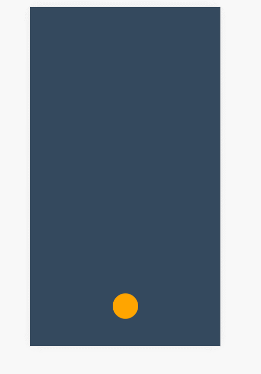
修改关键帧速率制作弹跳球:
- <!DOCTYPE html>
- <html lang="en">
- <head>
- <meta charset="UTF-8">
- <title>Document</title>
- <meta name="viewport" content="width=device-width,minimum-scale=1.0,maximum-scale=1.0,user-scalable=no">
- <link rel="stylesheet" href="https://maxcdn.bootstrapcdn.com/font-awesome/4.7.0/css/font-awesome.min.css">
- <script src="https://cdn.staticfile.org/jquery/1.10.0/jquery.js"></script>
-
- <style>
- *{
- margin:0;
- padding:0;
- box-sizing:border-box;
- }
- body{
- width:100vw;
- height:100vh;
- background-color: #34495e;
- /* 栅格,一行五列 */
- display:grid;
- grid-template:1fr/repeat(5,1fr);
- }
-
- div{
- /* 栅格列的定位 */
- grid-column:3/4;
- justify-self:center;
- background:orange;
- height:50px;
- width:50px;
- border-radius:50%;
- animation-name:move;
- animation-duration:4s;
- animation-iteration-count:infinite;
- animation-fill-mode:forwards;
- }
- @keyframes move{
- /* 向上弹的帧 */
- 0%{
- transform:translateY(0vh);
- }
- 30%{
- transform:translateY(10vh);
- }
- 60%{
- transform:translateY(40vh);
- }
- 80%{
- transform:translateY(60vh);
- }
- 95%{
- transform:translateY(75vh);
- }
- 0%,30%,60%,80%,95%{
- animation-timing-function:ease-in;
- }
- /* 向下落的帧 */
- 15%,45%,75%,85%,100%{
- transform:translateY(90vh);
- animation-timing-function:ease-out;
- }
- }
- </style>
- </head>
- <body>
- <div></div>
- </body>
- </html>
盒阴影偏移技巧与currentColor特性:
currentColor 指当前定义的color的颜色
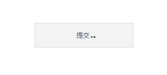
提交按钮加载动画效果:
- <!DOCTYPE html>
- <html lang="en">
- <head>
- <meta charset="UTF-8">
- <title>Document</title>
- <meta name="viewport" content="width=device-width,minimum-scale=1.0,maximum-scale=1.0,user-scalable=no">
- <link rel="stylesheet" href="https://maxcdn.bootstrapcdn.com/font-awesome/4.7.0/css/font-awesome.min.css">
- <script src="https://cdn.staticfile.org/jquery/1.10.0/jquery.js"></script>
-
- <style>
- *{
- margin:0;
- padding:0;
- box-sizing:border-box;
- }
- body{
- width:100vw;
- height:100vh;
- display:grid;
- grid-template:1fr/1fr;
- }
-
- button{
- align-self:center;
- justify-self:center;
- background:#f3f3f3;
- height:50px;
- width:200px;
- color:#4e505f;
- border:1px solid #ddd;
- }
- button::after{
- content:'';
- width:3px;
- height:3px;
- display:inline-block; /*块元素才能加阴影*/
- box-shadow:3px 0 0 currentColor,9px 0 0 currentColor,15px 0 0 currentColor;
- animation-name:hd;
- animation-duration:1s;
- animation-iteration-count:infinite;
- }
- @keyframes hd{
- from{
- box-shadow:none;
- }
- 30%{
- box-shadow:3px 0 0 currentColor;
- }
- 60%{
- box-shadow:3px 0 0 currentColor,9px 0 0 currentColor;
- }
- 90%{
- box-shadow:3px 0 0 currentColor,9px 0 0 currentColor,15px 0 0 currentColor;
- }
- }
- </style>
- </head>
- <body>
- <button>提交</button>
- </body>
- </html>
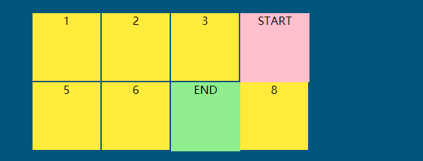
steps步进动画规则详解:
- <!DOCTYPE html>
- <html lang="en">
- <head>
- <meta charset="UTF-8">
- <title>Document</title>
- <link rel="stylesheet" href="https://maxcdn.bootstrapcdn.com/font-awesome/4.7.0/css/font-awesome.min.css">
-
- <style>
- *{
- margin:0;
- padding:0;
- box-sizing:border-box;
- list-style:none;
- }
- body{
- width:100vw;
- height:100vh;
- display:grid;
- background:#01547a;
- }
- main{
- width:400px;
- height:200px;
- background:red;
- justify-self:center;
- align-self:center;
- display:grid;
- grid-template:repeat(2,1fr)/repeat(4,1fr);
- }
- div{
- text-align:center;
- background:#ffeb3b;
- border:1px solid #01547a;
- box-sizing:border-box;
- position:relative;
- }
- div:nth-child(1)::before{
- content:'START';
- width:100px;
- height:100px;
- background:pink;
- position:absolute;
- top:0;
- left:0;
- animation-timing-function:steps(4,start);
- }
- div:nth-child(5)::before{
- content:'END';
- width:100px;
- height:100px;
- background:lightgreen;
- position:absolute;
- top:0;
- left:0;
- animation-timing-function:steps(4,end);
- }
- div:nth-child(1)::before,
- div:nth-child(5)::before{
- animation-name:hd;
- animation-duration:2s;
- animation-iteration-count:infinite;
- z-index:2;
- }
- @keyframes hd{
- to{
- transform:translateX(400px);
- }
- }
-
- </style>
- </head>
- <body>
- <main>
- <div>1</div>
- <div>2</div>
- <div>3</div>
- <div>4</div>
- <div>5</div>
- <div>6</div>
- <div>7</div>
- <div>8</div>
- </main>
- </body>
- </html>
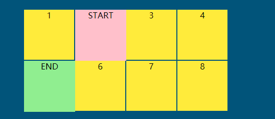
step-start与step-end单步处理:
- <!DOCTYPE html>
- <html lang="en">
- <head>
- <meta charset="UTF-8">
- <title>Document</title>
- <link rel="stylesheet" href="https://maxcdn.bootstrapcdn.com/font-awesome/4.7.0/css/font-awesome.min.css">
-
- <style>
- *{
- margin:0;
- padding:0;
- box-sizing:border-box;
- list-style:none;
- }
- body{
- width:100vw;
- height:100vh;
- display:grid;
- background:#01547a;
- }
- main{
- width:400px;
- height:200px;
- background:red;
- justify-self:center;
- align-self:center;
- display:grid;
- grid-template:repeat(2,1fr)/repeat(4,1fr);
- }
- div{
- text-align:center;
- background:#ffeb3b;
- border:1px solid #01547a;
- box-sizing:border-box;
- position:relative;
- }
- div:nth-child(1)::before{
- content:'START';
- width:100px;
- height:100px;
- background:pink;
- position:absolute;
- top:0;
- left:0;
- animation-timing-function:steps(1,start);
- animation-timing-function:step-start;
- }
- div:nth-child(5)::before{
- content:'END';
- width:100px;
- height:100px;
- background:lightgreen;
- position:absolute;
- top:0;
- left:0;
- animation-timing-function:steps(1,end);
- animation-timing-function:step-end;
- }
- div:nth-child(1)::before,
- div:nth-child(5)::before{
- animation-name:hd;
- animation-duration:2s;
- animation-iteration-count:infinite;
- z-index:2;
- }
- @keyframes hd{
- 50%{
- transform:translateX(100px);
- }
- to{
- transform:translateX(0);
- }
- }
-
- </style>
- </head>
- <body>
- <main>
- <div>1</div>
- <div>2</div>
- <div>3</div>
- <div>4</div>
- <div>5</div>
- <div>6</div>
- <div>7</div>
- <div>8</div>
- </main>
- </body>
- </html>
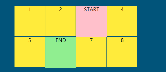
animation-play-state 控制动画播放与暂停:
- <!DOCTYPE html>
- <html lang="en">
- <head>
- <meta charset="UTF-8">
- <title>Document</title>
- <link rel="stylesheet" href="https://maxcdn.bootstrapcdn.com/font-awesome/4.7.0/css/font-awesome.min.css">
-
- <style>
- *{
- margin:0;
- padding:0;
- box-sizing:border-box;
- list-style:none;
- }
- body{
- width:100vw;
- height:100vh;
- display:grid;
- background:#01547a;
- }
- main{
- width:400px;
- height:200px;
- background:red;
- justify-self:center;
- align-self:center;
- display:grid;
- grid-template:repeat(2,1fr)/repeat(4,1fr);
- }
- div{
- text-align:center;
- background:#ffeb3b;
- border:1px solid #01547a;
- box-sizing:border-box;
- position:relative;
- }
- div:nth-child(1)::before{
- content:'START';
- width:100px;
- height:100px;
- background:pink;
- position:absolute;
- top:0;
- left:0;
- animation-timing-function:steps(4,start);
- }
- div:nth-child(5)::before{
- content:'END';
- width:100px;
- height:100px;
- background:lightgreen;
- position:absolute;
- top:0;
- left:0;
- animation-timing-function:steps(4,end);
- }
- div:nth-child(1)::before,
- div:nth-child(5)::before{
- animation-name:hd;
- animation-duration:2s;
- animation-iteration-count:infinite;
- z-index:2;
- animation-play-state:paused;
- }
- main:hover div::before{
- animation-play-state:running;
- }
- @keyframes hd{
- to{
- transform:translateX(400px);
- }
- }
-
- </style>
- </head>
- <body>
- <main>
- <div>1</div>
- <div>2</div>
- <div>3</div>
- <div>4</div>
- <div>5</div>
- <div>6</div>
- <div>7</div>
- <div>8</div>
- </main>
- </body>
- </html>
纯css3的网站轮换图:
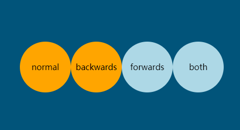
animation-fill-mode 动画填充模式:
- <!DOCTYPE html>
- <html lang="en">
- <head>
- <meta charset="UTF-8">
- <title>Document</title>
- <link rel="stylesheet" href="https://maxcdn.bootstrapcdn.com/font-awesome/4.7.0/css/font-awesome.min.css">
-
- <style>
- *{
- margin:0;
- padding:0;
- box-sizing:border-box;
- list-style:none;
- }
- body{
- width:100vw;
- height:100vh;
- display:grid;
- background:#01547a;
- }
- ul{
- list-style:none;
- width:400px;
- height:100px;
- justify-self:center;
- align-self:center;
- display:grid;
- grid-template:1fr/repeat(4,1fr);
- }
- li{
- width:100px;
- height:100px;
- background:orange;
- border-radius:50%;
- display:grid;
- justify-items:center;
- align-items:center;
- animation-name:hd;
- animation-duration:2s;
- animation-delay:2s;
- }
- li:nth-child(1){
- /* 延迟过程中使用元素默认的效果,结束之后回到默认的效果 */
- animation-fill-mode:normal;
- }
- li:nth-child(2){
- /* 延迟过程中使用起始帧的效果,结束之后回到默认的效果 */
- animation-fill-mode:backwards;
- }
- li:nth-child(3){
- /* 延迟过程中使用元素默认的效果,结束之后回到结束帧 */
- animation-fill-mode:forwards;
- }
- li:nth-child(4){
- /* 延迟过程中使用起始帧的效果,结束之后回到结束帧 */
- animation-fill-mode:both;
- }
- @keyframes hd{
- from{
- transform:scale(0);
- }
- to{
- transform:scale(1);
- background:lightblue;
- }
- }
- </style>
- </head>
- <body>
- <ul>
- <li>normal</li>
- <li>backwards</li>
- <li>forwards</li>
- <li>both</li>
- </ul>
- </body>
- </html>
animation动画组合定义语法:
- <!DOCTYPE html>
- <html lang="en">
- <head>
- <meta charset="UTF-8">
- <title>Document</title>
- <link rel="stylesheet" href="https://maxcdn.bootstrapcdn.com/font-awesome/4.7.0/css/font-awesome.min.css">
-
- <style>
- *{
- margin:0;
- padding:0;
- box-sizing:border-box;
- list-style:none;
- }
- body{
- width:100vw;
- height:100vh;
- display:grid;
- background:#01547a;
- }
- ul{
- list-style:none;
- width:400px;
- height:100px;
- justify-self:center;
- align-self:center;
- display:grid;
- grid-template:1fr/repeat(4,1fr);
- }
- li{
- width:100px;
- height:100px;
- background:orange;
- border-radius:50%;
- display:grid;
- justify-items:center;
- align-items:center;
- }
- li:nth-child(1){
- /* 延迟过程中使用元素默认的效果,结束之后回到默认的效果 */
- animation:hd normal 2s 2s;
- }
- li:nth-child(2){
- /* 延迟过程中使用起始帧的效果,结束之后回到默认的效果 */
- animation:hd backwards 2s 2s;
- }
- li:nth-child(3){
- /* 延迟过程中使用元素默认的效果,结束之后回到结束帧 */
- animation:hd forwards 2s 2s;
- }
- li:nth-child(4){
- /* 延迟过程中使用起始帧的效果,结束之后回到结束帧 */
- animation:hd both 2s 2s;
- }
- @keyframes hd{
- from{
- transform:scale(0);
- }
- to{
- transform:scale(1);
- background:lightblue;
- }
- }
- </style>
- </head>
- <body>
- <ul>
- <li>normal</li>
- <li>backwards</li>
- <li>forwards</li>
- <li>both</li>
- </ul>
- </body>
- </html>

 经验首页
经验首页