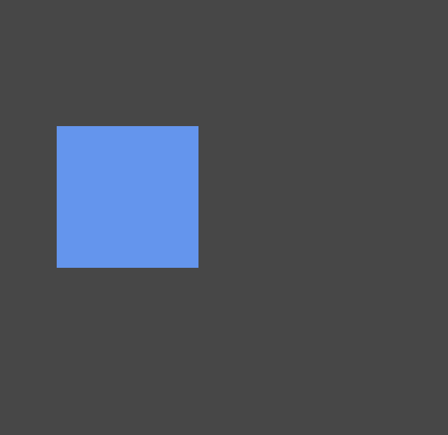
css3过渡使用场景分析:
- <!DOCTYPE html>
- <html lang="en">
- <head>
- <meta charset="UTF-8">
- <title>Document</title>
- <meta name="viewport" content="width=device-width,minimum-scale=1.0,maximum-scale=1.0,user-scalable=no">
- <link rel="stylesheet" href="https://maxcdn.bootstrapcdn.com/font-awesome/4.7.0/css/font-awesome.min.css">
-
- <style>
- *{
- margin:0;
- padding:0;
- box-sizing:border-box;
- }
- body{
- width:100vw;
- height:100vh;
- display:flex;
- justify-content: center;
- align-items: center;
- background-color: #474747;
- }
- main{
- width:400px;
- height:400px;
- }
- div{
- width:200px;
- height:200px;
- background-color: cornflowerblue;
- transition:1s;
- }
- div:hover {
- border-radius:50%;
- }
- </style>
- </head>
- <body>
- <main>
- <div></div>
- </main>
- </body>
- </html>

属性中间值对过渡的影响:
没有中间值的属性无法实现过渡动画效果
- <!DOCTYPE html>
- <html lang="en">
- <head>
- <meta charset="UTF-8">
- <title>Document</title>
- <meta name="viewport" content="width=device-width,minimum-scale=1.0,maximum-scale=1.0,user-scalable=no">
- <link rel="stylesheet" href="https://maxcdn.bootstrapcdn.com/font-awesome/4.7.0/css/font-awesome.min.css">
-
- <style>
- *{
- margin:0;
- padding:0;
- box-sizing:border-box;
- }
- body{
- width:100vw;
- height:100vh;
- display:flex;
- justify-content: center;
- align-items: center;
- background-color: #474747;
- }
- main{
- width:400px;
- height:400px;
- }
- div{
- width:200px;
- height:200px;
- background-color: cornflowerblue;
- transition:1s;
- border:10px solid pink;
- }
- div:hover {
- border-radius:50%;
- width:400px;
- height:400px;
- border:20px dotted lightblue;
- }
- </style>
- </head>
- <body>
- <main>
- <div></div>
- </main>
- </body>
- </html>

定制css过渡效果属性:
- <!DOCTYPE html>
- <html lang="en">
- <head>
- <meta charset="UTF-8">
- <title>Document</title>
- <meta name="viewport" content="width=device-width,minimum-scale=1.0,maximum-scale=1.0,user-scalable=no">
- <link rel="stylesheet" href="https://maxcdn.bootstrapcdn.com/font-awesome/4.7.0/css/font-awesome.min.css">
-
- <style>
- *{
- margin:0;
- padding:0;
- box-sizing:border-box;
- }
- body{
- width:100vw;
- height:100vh;
- display:flex;
- justify-content: center;
- align-items: center;
- background-color: #474747;
- }
- main{
- width:400px;
- height:400px;
- }
- div{
- width:200px;
- height:200px;
- background-color: cornflowerblue;
- border:10px solid white;
- /* 过渡属性 */
- transition-property:background,width,height,border-radius;
- transition-property:all;
- /* 过渡持续时间 */
- transition-duration:2s;
- margin-bottom:50px;
- }
- main:hover div{
- background-color: pink;
- border-radius:50%;
- width:400px;
- height:400px;
- }
- div:nth-child(1){
- transition-property:all;
- }
- div:nth-child(2){
- transition-property:none;
- }
- </style>
- </head>
- <body>
- <main>
- <div></div>
- <div></div>
- </main>
- </body>
- </html>

transitionend动画API接口:
- <!DOCTYPE html>
- <html lang="en">
- <head>
- <meta charset="UTF-8">
- <title>Document</title>
- <meta name="viewport" content="width=device-width,minimum-scale=1.0,maximum-scale=1.0,user-scalable=no">
- <link rel="stylesheet" href="https://maxcdn.bootstrapcdn.com/font-awesome/4.7.0/css/font-awesome.min.css">
-
- <style>
- *{
- margin:0;
- padding:0;
- box-sizing:border-box;
- }
- body{
- width:100vw;
- height:100vh;
- display:flex;
- justify-content: center;
- align-items: center;
- background-color: #474747;
- }
- main{
- width:400px;
- height:400px;
- }
- div{
- width:200px;
- height:200px;
- position:relative;
- }
- div::before{
- position:absolute;
- width:200px;
- height:200px;
- background-color: cornflowerblue;
- border-radius:10%;
- content:'cyy';
- display:flex;
- justify-content: center;
- align-items: center;
- color:white;
- font-size:2em;
- transition:2s;
- cursor:pointer;
- }
- div:hover::before{
- transform:rotate(360deg);
- }
- div::after{
- position:absolute;
- width:200px;
- bottom:-55px;
- content:'cyy is cute~';
- color:white;
- font-size:1.2em;
- text-align:center;
- transition:2s;
- cursor:pointer;
- transform:translateX(-999px);
- }
- div.move::after{
- transform:translateX(0);
- }
- </style>
- </head>
- <body>
- <main>
- <div></div>
- </main>
-
- <script>
- document.querySelector('div').addEventListener('transitionend',function(e){
- console.log(e)
- document.querySelector('div').className = 'move';
- })
- </script>
- </body>
- </html>

transition-duration 过渡时间使用技巧:
过渡时间与过渡属性一一配对,当过渡时间数量少于过渡属性时,会循环回到最初的过渡时间
- <!DOCTYPE html>
- <html lang="en">
- <head>
- <meta charset="UTF-8">
- <title>Document</title>
- <meta name="viewport" content="width=device-width,minimum-scale=1.0,maximum-scale=1.0,user-scalable=no">
- <link rel="stylesheet" href="https://maxcdn.bootstrapcdn.com/font-awesome/4.7.0/css/font-awesome.min.css">
-
- <style>
- *{
- margin:0;
- padding:0;
- box-sizing:border-box;
- }
- body{
- width:100vw;
- height:100vh;
- display:flex;
- justify-content: center;
- align-items: center;
- background-color: #474747;
- }
- main{
- width:400px;
- height:400px;
- }
- div{
- width:200px;
- height:200px;
- background-color: cornflowerblue;
- transition-property:background,width,height;
- /* 过渡属性height会选择过渡时间1s */
- transition-duration:1s,2s;
- }
- div:hover {
- width:400px;
- height:400px;
- background-color: pink;
- border-radius:50%;
- }
- </style>
- </head>
- <body>
- <main>
- <div></div>
- </main>
- </body>
- </html>
不同状态过渡时间效果控制:
- <!DOCTYPE html>
- <html lang="en">
- <head>
- <meta charset="UTF-8">
- <title>Document</title>
- <meta name="viewport" content="width=device-width,minimum-scale=1.0,maximum-scale=1.0,user-scalable=no">
- <link rel="stylesheet" href="https://maxcdn.bootstrapcdn.com/font-awesome/4.7.0/css/font-awesome.min.css">
-
- <style>
- *{
- margin:0;
- padding:0;
- box-sizing:border-box;
- }
- body{
- width:100vw;
- height:100vh;
- display:flex;
- justify-content: center;
- align-items: center;
- background-color: #474747;
- }
- main{
- width:400px;
- height:400px;
- }
- div{
- width:200px;
- height:200px;
- background-color: cornflowerblue;
- transition-property:background,width,height;
- /* 过渡属性height会选择过渡时间1s */
- transition-duration:1s,2s;
- }
- div:hover {
- width:400px;
- height:400px;
- background-color: pink;
- border-radius:50%;
- transition-property:background;
- /* 过渡属性height会选择过渡时间1s */
- transition-duration:1s;
- }
- </style>
- </head>
- <body>
- <main>
- <div></div>
- </main>
- </body>
- </html>

transition-timing-function 控制运行轨迹:
贝塞尔曲线工具网:https://cubic-bezier.com/#.11,.75,.92,.57
- <!DOCTYPE html>
- <html lang="en">
- <head>
- <meta charset="UTF-8">
- <title>Document</title>
- <meta name="viewport" content="width=device-width,minimum-scale=1.0,maximum-scale=1.0,user-scalable=no">
- <link rel="stylesheet" href="https://maxcdn.bootstrapcdn.com/font-awesome/4.7.0/css/font-awesome.min.css">
-
- <style>
- *{
- margin:0;
- padding:0;
- box-sizing:border-box;
- }
- body{
- width:100vw;
- height:100vh;
- display:flex;
- justify-content: center;
- align-items: center;
- background-color: #474747;
- }
- main{
- width:400px;
- height:400px;
- }
- div{
- width:200px;
- height:200px;
- background-color: cornflowerblue;
- transition-duration:3s;
- transition-timing-function:cubic-bezier(.15,.79,.72,-0.09);
- }
- div:hover {
- width:400px;
- height:400px;
- background-color: pink;
- border-radius:50%;
- }
- </style>
- </head>
- <body>
- <main>
- <div></div>
- </main>
- </body>
- </html>


steps步进帧动画控制效果:
steps() 设置间隔参数,可以实现分步过渡
第一个参数指定了时间函数中的间隔数量(必须是正整数)
第二个参数可选,接受 start 和 end 两个值,指定在每个间隔的起点或是终点发生阶跃变化,默认为 end。
- <!DOCTYPE html>
- <html lang="en">
- <head>
- <meta charset="UTF-8">
- <title>Document</title>
- <meta name="viewport" content="width=device-width,minimum-scale=1.0,maximum-scale=1.0,user-scalable=no">
- <link rel="stylesheet" href="https://maxcdn.bootstrapcdn.com/font-awesome/4.7.0/css/font-awesome.min.css">
-
- <style>
- *{
- margin:0;
- padding:0;
- box-sizing:border-box;
- }
- body{
- width:100vw;
- height:100vh;
- display:flex;
- justify-content: center;
- align-items: center;
- background-color: #474747;
- }
- main{
- width:400px;
- height:400px;
- }
- div{
- width:200px;
- height:200px;
- background-color: cornflowerblue;
- transition-duration:1s;
-
- transition-timing-function:steps(3,end);
- transition-timing-function:steps(1,end);
- transition-timing-function:steps(1,start);
- transition-timing-function:step-start;
- transition-timing-function:step-end;
- transition-timing-function:steps(3,start);
- }
- div:hover {
- width:400px;
- height:400px;
- background-color: pink;
- border-radius:50%;
- }
- </style>
- </head>
- <body>
- <main>
- <div></div>
- </main>
- </body>
- </html>

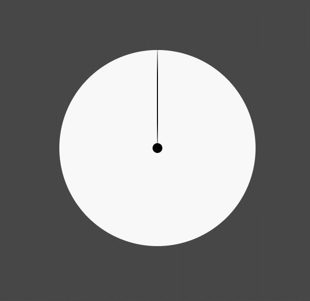
使用steps步进过渡制作时钟:
- <!DOCTYPE html>
- <html lang="en">
- <head>
- <meta charset="UTF-8">
- <title>Document</title>
- <meta name="viewport" content="width=device-width,minimum-scale=1.0,maximum-scale=1.0,user-scalable=no">
- <link rel="stylesheet" href="https://maxcdn.bootstrapcdn.com/font-awesome/4.7.0/css/font-awesome.min.css">
-
- <style>
- *{
- margin:0;
- padding:0;
- box-sizing:border-box;
- }
- body{
- width:100vw;
- height:100vh;
- display:flex;
- justify-content: center;
- align-items: center;
- background-color: #474747;
- }
- main{
- width:400px;
- height:400px;
- background:white;
- border-radius:50%;
- position:relative;
- }
- main::before{
- content:'';
- width:20px;
- height:20px;
- background-color: black;
- border-radius:50%;
- position:absolute;
- left:50%;
- top:50%;
- transform:translate(-50%,-50%);
- }
- main::after{
- content:'';
- width:2px;
- height:50%;
- background-color: black;
- border-radius:50%;
- position:absolute;
- left:50%;
- top:0;
- transform:translateX(-50%);
- transition:60s;
- transform-origin:bottom;
- transition-timing-function:steps(60,start);
- }
- main:hover::after{
- transform:translateX(-50%) rotate(360deg);
- }
- </style>
- </head>
- <body>
- <main>
-
- </main>
- </body>
- </html>
step-end与step-start使用:
- <!DOCTYPE html>
- <html lang="en">
- <head>
- <meta charset="UTF-8">
- <title>Document</title>
- <meta name="viewport" content="width=device-width,minimum-scale=1.0,maximum-scale=1.0,user-scalable=no">
- <link rel="stylesheet" href="https://maxcdn.bootstrapcdn.com/font-awesome/4.7.0/css/font-awesome.min.css">
-
- <style>
- *{
- margin:0;
- padding:0;
- box-sizing:border-box;
- }
- body{
- width:100vw;
- height:100vh;
- display:flex;
- justify-content: center;
- align-items: center;
- background-color: #474747;
- }
- ul{
- width:400px;
- height:300px;
- display:flex;
- position:relative;
- list-style:none;
- }
- li{
- flex:1;
- border:1px solid #ddd;
- text-align:center;
- }
- ul::before{
- content:'start';
- width:200px;
- height:100px;
- background:orange;
- position:absolute;
- top:0;
- left:0;
- transition-duration:1s;
- font-size:2em;
- color:white;
- transition-timing-function:step-start;
- z-index:2;
- }
- ul::after{
- content:'end';
- width:200px;
- height:100px;
- background:purple;
- position:absolute;
- bottom:0;
- left:0;
- transition-duration:1s;
- font-size:2em;
- color:white;
- transition-timing-function:step-end;
- z-index:2;
- }
- ul:hover::before,ul:hover::after{
- transform:translateX(200px);
- }
-
- </style>
- </head>
- <body>
- <main>
- <ul>
- <li></li>
- <li></li>
- </ul>
- </main>
- </body>
- </html>
纯css图片切换效果:
- <!DOCTYPE html>
- <html lang="en">
- <head>
- <meta charset="UTF-8">
- <title>Document</title>
- <meta name="viewport" content="width=device-width,minimum-scale=1.0,maximum-scale=1.0,user-scalable=no">
- <link rel="stylesheet" href="https://maxcdn.bootstrapcdn.com/font-awesome/4.7.0/css/font-awesome.min.css">
-
- <style>
- *{
- margin:0;
- padding:0;
- box-sizing:border-box;
- }
- body{
- width:100vw;
- height:100vh;
- display:flex;
- justify-content: center;
- align-items: center;
- background-color: #474747;
- }
- main{
- width:400px;
- height:200px;
- overflow:hidden;
- }
- main:hover section{
- transform:translateX(-50%);
- }
- section{
- width:800px;
- height:200px;
- display:flex;
- transition:1s;
- transition-timing-function:step-start;
- }
- div{
- width:400px;
- height:200px;
- overflow:hidden;
- }
- img{
- width:100%;
- height:100%;
- }
- </style>
- </head>
- <body>
- <main>
- <section>
- <div><img src="https://ss1.bdstatic.com/70cFvXSh_Q1YnxGkpoWK1HF6hhy/it/u=2329224269,1458878414&fm=26&gp=0.jpg" alt=""></div>
- <div><img src="https://timgsa.baidu.com/timg?image&quality=80&size=b9999_10000&sec=1605093891148&di=5a12000e61c98e16a488d9570ce09b4d&imgtype=0&src=http%3A%2F%2Fimg2.imgtn.bdimg.com%2Fit%2Fu%3D4042660312%2C2429876079%26fm%3D214%26gp%3D0.jpg" alt=""></div>
- </section>
- </main>
- </body>
- </html>

transition-delay 延迟过渡使用:
多用于下拉导航显示,鼠标移入一定时间后再显示;鼠标移入立刻移出则不显示
- <!DOCTYPE html>
- <html lang="en">
- <head>
- <meta charset="UTF-8">
- <title>Document</title>
- <meta name="viewport" content="width=device-width,minimum-scale=1.0,maximum-scale=1.0,user-scalable=no">
- <link rel="stylesheet" href="https://maxcdn.bootstrapcdn.com/font-awesome/4.7.0/css/font-awesome.min.css">
-
- <style>
- *{
- margin:0;
- padding:0;
- box-sizing:border-box;
- }
- body{
- width:100vw;
- height:100vh;
- display:flex;
- justify-content: center;
- align-items: center;
- background-color: #474747;
- }
- main{
- width:400px;
- height:200px;
- overflow:hidden;
- }
- main:hover section{
- transform:translateX(-50%);
- }
- section{
- width:800px;
- height:200px;
- display:flex;
- transition:1s;
- transition-delay:1s;
- }
- div{
- width:400px;
- height:200px;
- overflow:hidden;
- }
- img{
- width:100%;
- height:100%;
- }
- </style>
- </head>
- <body>
- <main>
- <section>
- <div><img src="https://ss1.bdstatic.com/70cFvXSh_Q1YnxGkpoWK1HF6hhy/it/u=2329224269,1458878414&fm=26&gp=0.jpg" alt=""></div>
- <div><img src="https://timgsa.baidu.com/timg?image&quality=80&size=b9999_10000&sec=1605093891148&di=5a12000e61c98e16a488d9570ce09b4d&imgtype=0&src=http%3A%2F%2Fimg2.imgtn.bdimg.com%2Fit%2Fu%3D4042660312%2C2429876079%26fm%3D214%26gp%3D0.jpg" alt=""></div>
- </section>
- </main>
- </body>
- </html>
transition 组合设置全部过渡规则:
- <!DOCTYPE html>
- <html lang="en">
- <head>
- <meta charset="UTF-8">
- <title>Document</title>
- <meta name="viewport" content="width=device-width,minimum-scale=1.0,maximum-scale=1.0,user-scalable=no">
- <link rel="stylesheet" href="https://maxcdn.bootstrapcdn.com/font-awesome/4.7.0/css/font-awesome.min.css">
-
- <style>
- *{
- margin:0;
- padding:0;
- box-sizing:border-box;
- }
- body{
- width:100vw;
- height:100vh;
- display:flex;
- justify-content: center;
- align-items: center;
- background-color: #474747;
- }
- div{
- width:200px;
- height:200px;
- background:lightblue;
- transition:border-radius linear 1s,background ease 1s 1s;
- }
- body:hover div{
- border-radius:50%;
- background:pink;
- }
- </style>
- </head>
- <body>
- <div></div>
- </body>
- </html>

红心点赞案例:
- <!DOCTYPE html>
- <html lang="en">
- <head>
- <meta charset="UTF-8">
- <title>Document</title>
- <meta name="viewport" content="width=device-width,minimum-scale=1.0,maximum-scale=1.0,user-scalable=no">
- <link rel="stylesheet" href="https://maxcdn.bootstrapcdn.com/font-awesome/4.7.0/css/font-awesome.min.css">
- <script src="https://cdn.staticfile.org/jquery/1.10.0/jquery.js"></script>
-
- <style>
- *{
- margin:0;
- padding:0;
- box-sizing:border-box;
- }
- body{
- width:100vw;
- height:100vh;
- display:flex;
- justify-content: center;
- align-items: center;
- background-color: #f3f3f3;
- }
- main{
- width:50px;
- height:50px;
- position:relative;
- border:1px solid #ddd;
- }
- i.fa{
- font-size:50px;
- color:#95a5a6;
- position:absolute;
- transition:1s;
- }
- main.heart i.fa{
- transform:scale(3);
- color:crimson;
- opacity:0;
- }
- main.heart i.fa:nth-child(1){
- transform:scale(1);
- opacity:1;
- }
- </style>
- </head>
- <body>
- <main onclick="heart()">
- <i class="fa fa-heart" aria-hidden="true"></i>
- <i class="fa fa-heart" aria-hidden="true"></i>
- </main>
-
- <script>
- function heart(){
- $('main').toggleClass('heart');
- }
- </script>
- </body>
- </html>


 经验首页
经验首页