描述
使用图表结合数据可以很直观的视觉效应,大屏展示已经成为企业数据展示的常见场景,如何做到大屏自适应是我们需要解决的一个问题,下面是其中一种解决方案,利用css的transform属性以及设计百分比,如有不足,请批评
实现
1.准备一个容器组件,width = 100vw,height = 100%,作为大屏展示的背景:
- <div class="screen-adapter">
- </div>
-
- .screen-adapter {
- width: 100vw;
- min-height: 100%;
- max-height: 100vh;
- overflow: hidden;
- background: #0c1a3c;
- }
2.根据设计同学提供的设计图可以计算出每部分区域的百分比,例如总尺寸是w*h,其中一个图标宽高是w1 * h1,实现常规切图,此时由1-->2可得:
- <div class="screen-adapter">
- <div class="content-wrap" :style="style">
- <slot></slot>
- </div>
- </div>
- props: {
- w: { // 设计图尺寸宽
- type: Number,
- default: 1600
- },
- h: { // 设计图尺寸高
- type: Number,
- default: 900
- }
- },
- data () {
- return {
- style: {
- width: this.w + 'px',
- height: this.h + 'px',
- transform: 'scale(1) translate(-50%, -50%)' // 默认不缩放,垂直水平居中
- }
- }
- }
-
- .content-wrap {
- transform-origin: 0 0;
- position: absolute;
- top: 50%;
- left: 50%;
- }
3.基于第二步,需要根据大屏具体尺寸计算缩放比例,以及设置缩放比例,需要注意的是,绑定resize事件一定别忘了防抖,页面销毁别忘了移除监听事件:
- mounted () {
- this.setScale()
- this.onresize = this.debounce(() => this.setScale(), 100)
- window.addEventListener('resize', this.onresize)
- },
- beforeDestroy () {
- window.removeEventListener('resize', this.onresize)
- },
- methods: {
- // 防抖
- debounce (fn, t) {
- const delay = t || 500
- let timer
- return function () {
- const args = arguments
- if (timer) {
- clearTimeout(timer)
- }
- const context = this
- timer = setTimeout(() => {
- timer = null
- fn.apply(context, args)
- }, delay)
- }
- },
- // 获取缩放比例
- getScale () {
- const w = window.innerWidth / this.w
- const h = window.innerHeight / this.h
- return w < h ? w : h
- },
- // 设置缩放比例
- setScale () {
- this.style.transform = `scale(${this.getScale()}) translate(-50%, -50%)`
- }
- }
4.至此,大概结构已经得到,只需要将各部分图标组件还原的设计图放入之前的 插槽即可,各部分图标组件的尺寸按照设计提供的百分比即可,所有代码大致如下:
- // ScreenAdapter.vue
- <template>
- <div class="screen-adapter">
- <div class="content-wrap" :style="style">
- <slot></slot>
- </div>
- </div>
- </template>
- <script>
- export default {
- props: {
- w: {
- type: Number,
- default: 1600
- },
- h: {
- type: Number,
- default: 900
- }
- },
- data () {
- return {
- style: {
- width: this.w + 'px',
- height: this.h + 'px',
- transform: 'scale(1) translate(-50%, -50%)'
- }
- }
- },
- mounted () {
- this.setScale()
- this.onresize = this.Debounce(() => this.setScale(), 100)
- window.addEventListener('resize', this.onresize)
- },
- beforeDestroy () {
- window.removeEventListener('resize', this.onresize)
- },
- methods: {
- Debounce (fn, t) {
- const delay = t || 500
- let timer
- return function () {
- const args = arguments
- if (timer) {
- clearTimeout(timer)
- }
- const context = this
- timer = setTimeout(() => {
- timer = null
- fn.apply(context, args)
- }, delay)
- }
- },
- getScale () {
- const w = window.innerWidth / this.w
- const h = window.innerHeight / this.h
- return w < h ? w : h
- },
- setScale () {
- this.style.transform = `scale(${this.getScale()}) translate(-50%, -50%)`
- }
- }
- }
- </script>
- <style>
- .screen-adapter {
- width: 100%;
- min-height: 100vh;
- max-height: 100vh;
- overflow: hidden;
- background: #0c1a3c;
- }
- .content-wrap {
- transform-origin: 0 0;
- position: absolute;
- top: 50%;
- left: 50%;
- }
- </style>
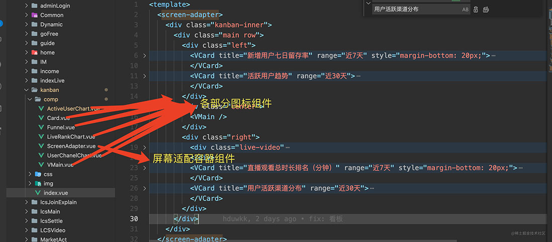
项目目录结构如下
效果图如下
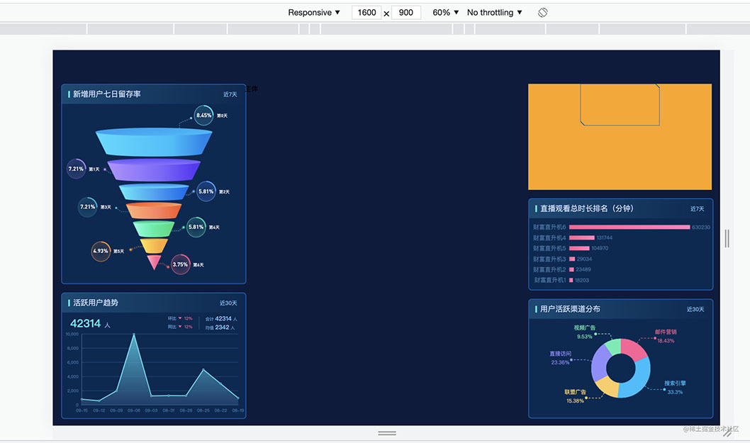

可以看出,字体图表都是等比例缩放的
总结
到此这篇关于Echats图表大屏自适应实现的文章就介绍到这了,更多相关Echats图表大屏自适应内容请搜索w3xue以前的文章或继续浏览下面的相关文章希望大家以后多多支持w3xue!

 经验首页
经验首页