接上一篇# Echart Bar柱状图样式详解续写,可以先看看上一篇,不看的话,影响也不是特别大。
横向柱状图
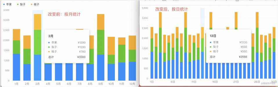
动态更新数据和样式
实现数据按月统计和按日统计的动态切换。按月统计时,每个月数据都会展示,x 轴显示 12 个标签;按日统计时,x 轴不完全显示所有标签,间隔显示,而且柱状体的宽度也会变化。主要是采用的是setOption方法。
官方文档[setOption]:echarts.apache.org/zh/api.html…
- <script>
- import * as R from "ramda";
-
- const source1 = [
- ["1月", 1330, 666, 560],
- ["2月", 820, 760, 660],
- ......
- ["11月", 901, 880, 360],
- ["12月", 934, 600, 700],
- ];
- const source2 = [
- ["1日", 1330, 666, 560],
- ["2日", 820, 760, 660],
- ......
- ["29日", 934, 600, 700],
- ["30日", 1330, 666, 560],
- ];
-
- // 具体配置如之前所示,详细省略,只做基本示例展示
- const initOption = {
- ...
- dataset: { source: source1 },
- };
-
- export default {
- data() {
- return {
- charts: null,
- isDaily: false,
- };
- },
- mounted() {
- this.charts = this.$echarts.init(
- document.getElementById("barCharts"),
- null,
- {
- renderer: "svg",
- }
- );
- this.charts.setOption(R.clone(initOption));
- },
- methods: {
- handleSource() {
- this.isDaily = !this.isDaily;
- this.charts.setOption(
- R.mergeDeepRight(initOption, {
- // 动态更新数据源
- dataset: {
- source: this.isDaily ? source2 : source1,
- },
- xAxis: {
- // 动态更新标签间隔
- axisLabel: {
- interval: this.isDaily ? 4 : "auto",
- },
- },
- series: R.map(
- // 动态更新柱体宽度
- (o) => ((o.barWidth = this.isDaily ? 12 : 24), o),
- initOption.series
- ),
- }),
- true
- );
- this.charts.resize();
- },
- },
- };
- </script>
解决 echarts 宽高自适应问题
在 web 项目中做图表时,图表的宽高不是固定的,需要随着浏览器宽度高度自适应,使用的方法就是resize。如果有多个图表,需要同时进行resize处理。
- <script>
- export default {
- mounted() {
- window.addEventListener("resize", this.handleResize, false);
- },
- destroyed() {
- window.removeEventListener("resize", this.handleResize);
- },
- methods: {
- handleResize() {
- const _this = this;
- const timer = setTimeout(() => {
- _this.lineCharts.resize();
- _this.barCharts.resize();
- }, 500);
- // 清除定时器
- this.$once("hook:beforeDestroy", () => {
- setTimeout(timer);
- });
- },
- },
- };
- </script>
纵向柱状图
纵向柱状图实现
本质和横向是一样的,就是将 x,y 轴值更换一下;x 轴为value,y 轴为category
- let option = {
- xAxis: {
- type: "value",
- },
- yAxis: {
- type: "category",
- },
- };
坐标指示器背景渐变色
其实原理和横向的一样,就是渐变色处理的地方 x,y 值更换一下
- let horizontalColor = {
- type: "linear",
- x: 1, // 更换
- y: 0,
- x2: 0,
- y2: 0, // 更换
- colorStops: [
- { offset: 0, color: "rgba(234,244,255,1)" },
- { offset: 1, color: "rgba(234,244,255,0.3)" },
- ],
- global: false,
- };
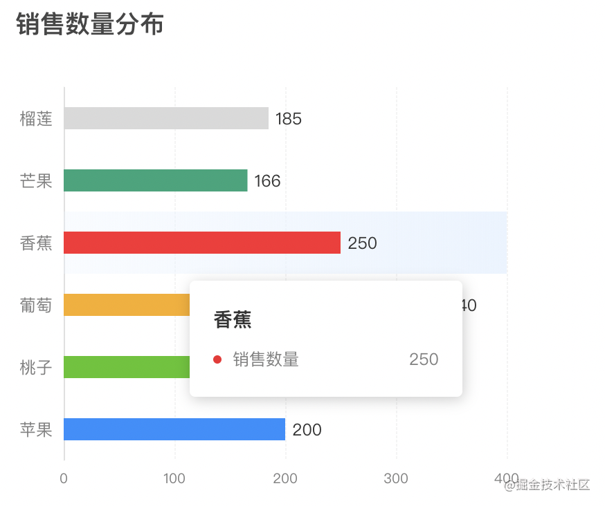
柱体设置不同颜色
柱体的属性设置series中color可以是一个函数,在函数中处理。核心代码为colorList[params.dataIndex]
- let colorList = [
- "#1890ff",
- "#52c41a",
- "#faad14",
- "#f5222d",
- "#1DA57A",
- "#d9d9d9",
- ];
- let series = [
- {
- type: "bar",
- barWidth: 16,
- itemStyle: {
- // 定制显示(按顺序),实现不同颜色的柱体
- color: (params) => {
- return colorList[params.dataIndex];
- },
- },
- dimensions: ["类型", "销售数量"],
- },
- ];
柱状图上方显示数值
柱体的属性设置series中label可以是一个函数,在函数中处理。可以设置位置,字体颜色和大小等。核心代码为params.value[params.encode.x[0]]。
- let series = [
- {
- // ......
- type: "bar",
- label: {
- // 柱图头部显示值
- show: true,
- position: "right",
- color: "#333",
- fontSize: "12px",
- formatter: (params) => {
- return params.value[params.encode.x[0]];
- },
- },
- },
- ];
tooltip 提示框自定义
和横向的一样,就是要注意取值params[0].axisValue, item.seriesName, item.value[item.encode.x[0]]
- let tooltip = R.merge(tooltip, {
- formatter: function(params) {
- let html = `<div style="height:auto;width:163px;">
- <div style="font-size:14px;font-weight:bold;color:#333;margin-bottom:16px;line-height:1;">
- ${params[0].axisValue}
- </div>
- ${params
- .map(
- (
- item
- ) => `<div style="font-size:12px;color:#808080;margin-bottom:8px;display:flex;align-items:center;line-height:1;">
- <span style="display:inline-block;margin-right:8px;border-radius:6px;width:6px;height:6px;background-color:${
- item.color
- };"></span>
- ${item.seriesName}
- <span style="flex:1;text-align:right;">${
- item.value[item.encode.x[0]]
- }</span>
- </div>`
- )
- .join("")}
- </div>`;
- return html;
- },
- });
总体实现
- charts.setOption({
- title: {
- text: "销售数量分布",
- },
- dataset: {
- source: [
- ["苹果", 200],
- ["桃子", 180],
- ["葡萄", 340],
- ["香蕉", 250],
- ["芒果", 166],
- ["榴莲", 185],
- ],
- },
- xAxis: R.merge(yAxis, {
- type: "value",
- }),
- yAxis: R.mergeDeepRight(xAxis, {
- type: "category",
- axisPointer: {
- shadowStyle: {
- color: horizontalColor,
- },
- },
- }),
- series,
- tooltip,
- });
总结
到此这篇关于Echarts Bar横向柱状图的文章就介绍到这了,更多相关Echarts Bar横向柱状图内容请搜索w3xue以前的文章或继续浏览下面的相关文章希望大家以后多多支持w3xue!
