先看效果:
前言:
这个思路是我在b站看up主Steven做的,觉得很不错,然后自己也弄了一个。(纯css)
实现:
定义标签,有三个水滴盒子,一个圆圈盒子显示数字,一个最底层盒子:
- <div class="kuang">
- <div class="droplet"></div>
- <div class="droplet"></div>
- <div class="droplet"></div>
- <div class="quan"></div>
- <span>99%</span>
- </div>
给最底层盒子基本的样式。flex布局,这样3个水滴暂时会垂直居中排列。
- .kuang{
- position: relative;
- height: 100vh;
- display: flex;
- flex-direction: column;
- justify-content: center;
- align-items: center;
- background-color: rgb(5,5,5);
- filter: contrast(30);
- }
filter: contrast(30);调整图像的对比度。值是0%的话,图像会全黑。值是100%,图像不变。值可以超过100%,意味着会运用更低的对比。若没有设置值,默认是1。
水滴的基本样式。绝对定位,这样3个盒子会重叠一起。
- .droplet{
- position: absolute;
- width: 100px;
- height: 100px;
- border-radius: 50%;
- background-color: rgb(61, 233, 99);
- filter: blur(20px);
- animation: fall 3s linear infinite;
- opacity: 0;
- }
filter: blur(20px);给图像设置模糊。
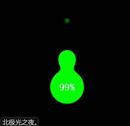
重点:我们给水滴盒子模糊度,这然三个水滴盒子会呈现一种模糊的状态。继而,我们给底层盒子设置图像对比度,这样模糊的图片会重新绘制轮廓,而得到下面的效果:

给要显示数字的圆圈基本样式。记住也要设置模糊度。这样在图像对比度下才会有与下落的水滴有融合的效果。
- .quan{
- position: absolute;
- width: 100px;
- height: 100px;
- border-radius: 50%;
- background-color: rgb(61, 233, 99);
- filter: blur(20px);
- animation: zhuan 3s infinite;
- }
给水滴设置动画,让它们从上往下落下,期间大小发生变化,这些可以自己慢慢调试,设置成自己认为最好的效果。
- @keyframes fall{
- 0%{
- opacity: 0;
- transform: scale(0.8) translateY(-500%);
- }
- 50%{
- opacity: 1;
- transform: scale(0.5) translateY(-100%) ;
- }
- 100%{
- transform: scale(0.3) translateY(0px);
- }
- }
第2和和第3个水滴延迟时间后再播放动画,这样3个水滴才会分开下落,至于几秒可以自己慢慢调试,设置成自己认为最好的效果。
- .kuang div:nth-of-type(2){
- animation-delay: 1.5s;
- }
- .kuang div:nth-of-type(3){
- animation-delay: 2s;
- }
给显示数字的圆圈动画效果,让它转起来。期间可以让它大小或角度发生或其它变化,具体数值可以自己慢慢调试,设置成自己认为最好的效果。
- @keyframes zhuan{
- 0%{
- transform: scale(1) rotate(0deg);
- }
- 50%{
- transform: scale(1.1) rotate(180deg);
- height: 90px;
- border-top-left-radius: 45%;
- border-bottom-left-radius: 48%;
-
- }
- 100%{
- transform:scale(1) rotate(360deg);
- }
- }
完整代码:
- <!DOCTYPE html>
- <html lang="en">
- <head>
- <meta charset="UTF-8">
- <meta name="viewport" content="width=device-width, initial-scale=1.0">
- <title>北极光之夜。</title>
- <style>
- *{
- margin: 0;
- padding: 0;
- box-sizing: border-box;
- }
- .kuang{
- position: relative;
- height: 100vh;
- display: flex;
- flex-direction: column;
- justify-content: center;
- align-items: center;
- background-color: rgb(5,5,5);
- filter: contrast(30);
- }
- .droplet{
- position: absolute;
- width: 100px;
- height: 100px;
- border-radius: 50%;
- background-color: rgb(61, 233, 99);
- filter: blur(20px);
- animation: fall 3s linear infinite;
- opacity: 0;
- }
- .kuang div:nth-of-type(2){
- animation-delay: 1.5s;
- }
- .kuang div:nth-of-type(3){
- animation-delay: 2s;
- }
- @keyframes fall{
- 0%{
- opacity: 0;
- transform: scale(0.8) translateY(-500%);
- }
- 50%{
- opacity: 1;
- transform: scale(0.5) translateY(-100%) ;
- }
- 100%{
- transform: scale(0.3) translateY(0px);
- }
- }
- .quan{
- position: absolute;
- width: 100px;
- height: 100px;
- border-radius: 50%;
- background-color: rgb(61, 233, 99);
- filter: blur(20px);
- animation: zhuan 3s infinite;
- }
- @keyframes zhuan{
- 0%{
- transform: scale(1) rotate(0deg);
- }
- 50%{
- transform: scale(1.1) rotate(180deg);
- height: 90px;
- border-top-left-radius: 45%;
- border-bottom-left-radius: 48%;
-
- }
- 100%{
- transform:scale(1) rotate(360deg);
- }
- }
- span{
- position: absolute;
- color: rgb(184, 182, 182);
- font-size: 26px;
- font-family: 'fangsong';
- font-weight: bold;
- }
- </style>
- </head>
- <body>
- <div class="kuang">
- <div class="droplet"></div>
- <div class="droplet"></div>
- <div class="droplet"></div>
- <div class="quan"></div>
- <span>99%</span>
- </div>
- </body>
- </html>
总结:
到此这篇关于html+css实现充电水滴融合特效代码的文章就介绍到这了,更多相关html 水滴融合内容请搜索w3xue以前的文章或继续浏览下面的相关文章,希望大家以后多多支持w3xue!

 经验首页
经验首页